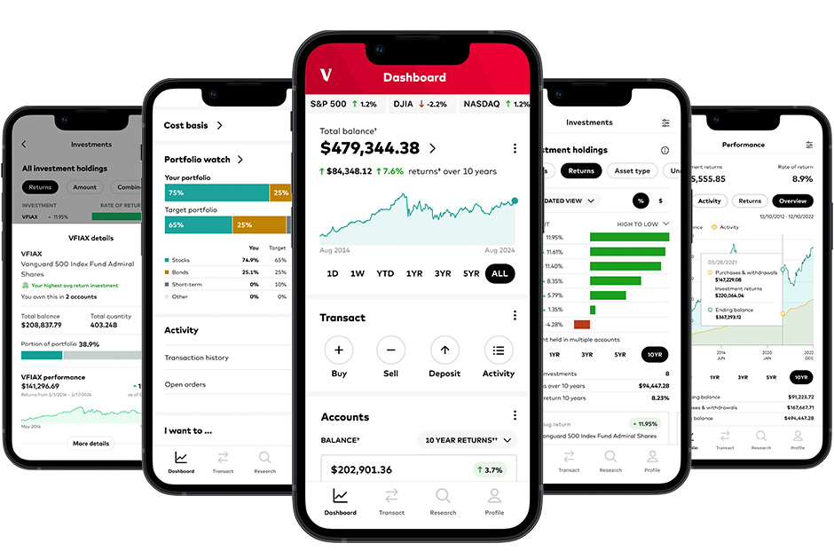
At Vanguard I have worked on a few different Mobile teams responsible for separate parts of the app. With each team I have worked to give clients the content & features they want, improve the experience and set clients up for the best chance of financial success.
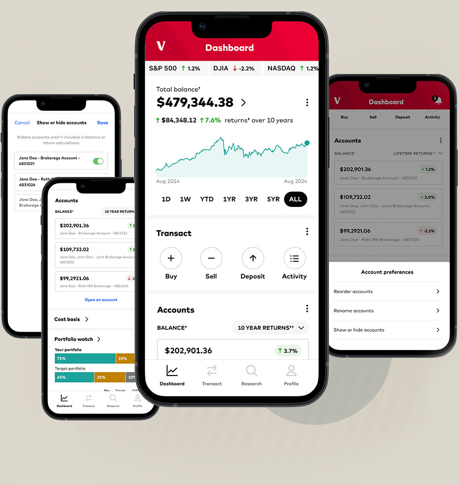
The Dashboard page is the first page people see when they log into the app. It's the most valuable page as all app trafic has to flow through there. The page is designed to help users achieve their top intents of checking their balance, performance, etc. I was part of a duo who redesigned the page, trying to account for user needs, business needs, as well as brand redesign needs.
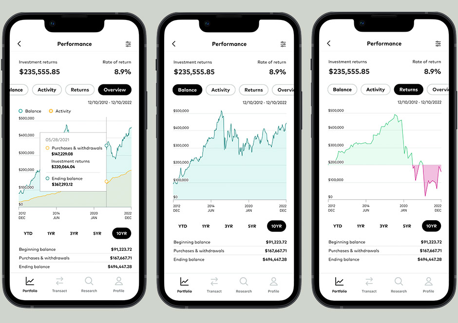
I redesigned the Performance page to be a mobile friendly way to analyze the performance of a client's portfolio. The page leads with a data visualization, followed by KPIs, then a data table – quick digestible information at the top of the page followed by a data table at the bottom for more detailed analysis. I reused this information architectural model elsewhere in the app as it has proven a successful. People fundamentally do not use mobile apps in the same way they use desktop experiences and this redesign was intentionally created to meet users where they are.
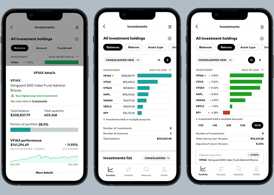
The Investments page is where a client can see all of their investments, aggregated into one place, regardless of account. I designed the Investments page to both match the features available to clients in Vanguard's web platform as well as give new ways of analysis previously not available. It reuses the information architectural model of the Performance giving clients quick info at the top and then detailed data tables at the bottom. This design is also the first time Vanguard clients could see a data visualization that directly compared their investments to one another.